First Chapter

Save As was tasked with creating First Chapters identity, giving us a blank canvas to construct a brand to match the premium nature of their work.
Brand Identity
First Chapters new identity includes font & colour styles to match the premium standard of work their work. We incorperated these styles into the logo & brand guidelines.
Web Design & Development
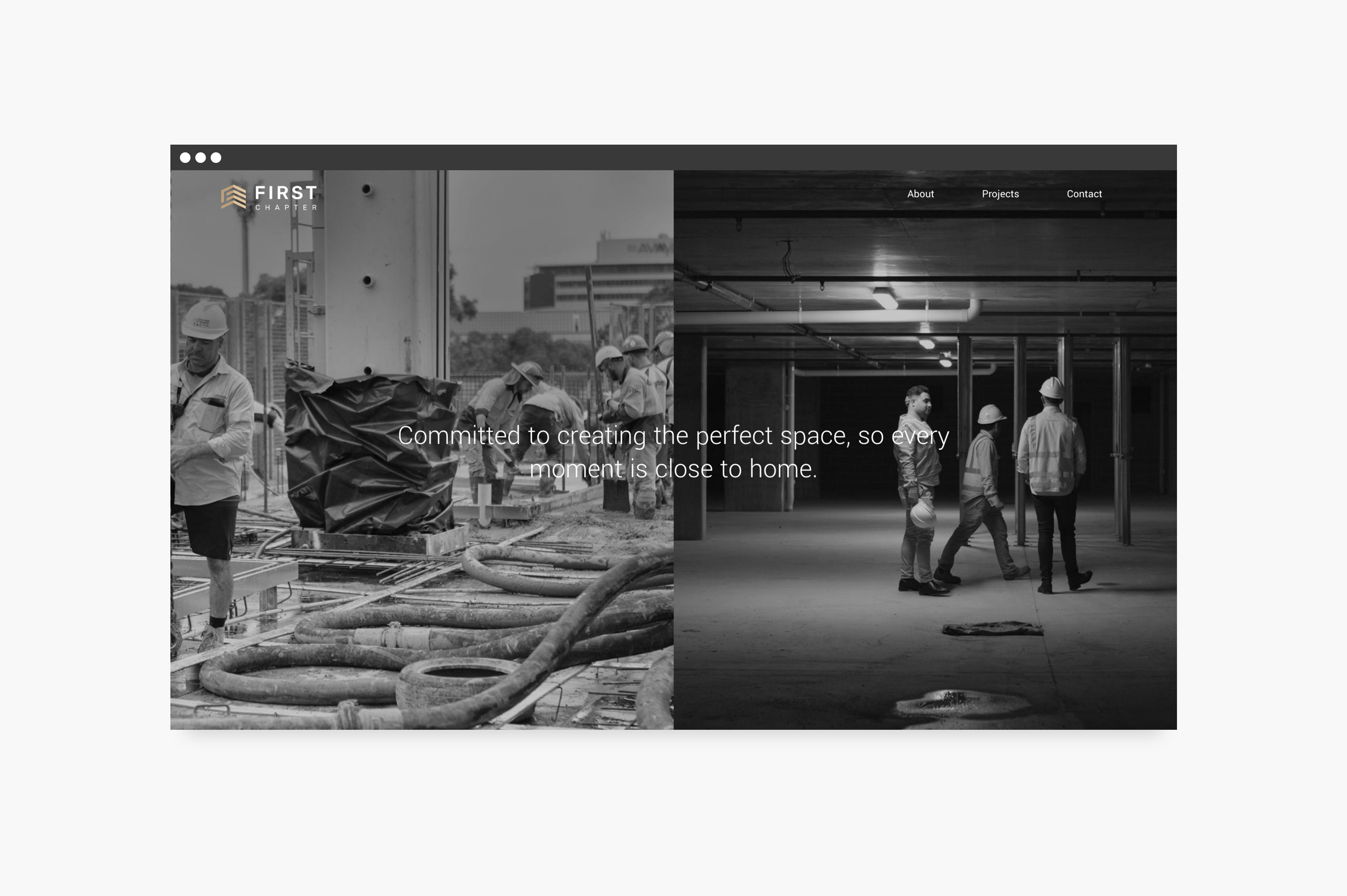
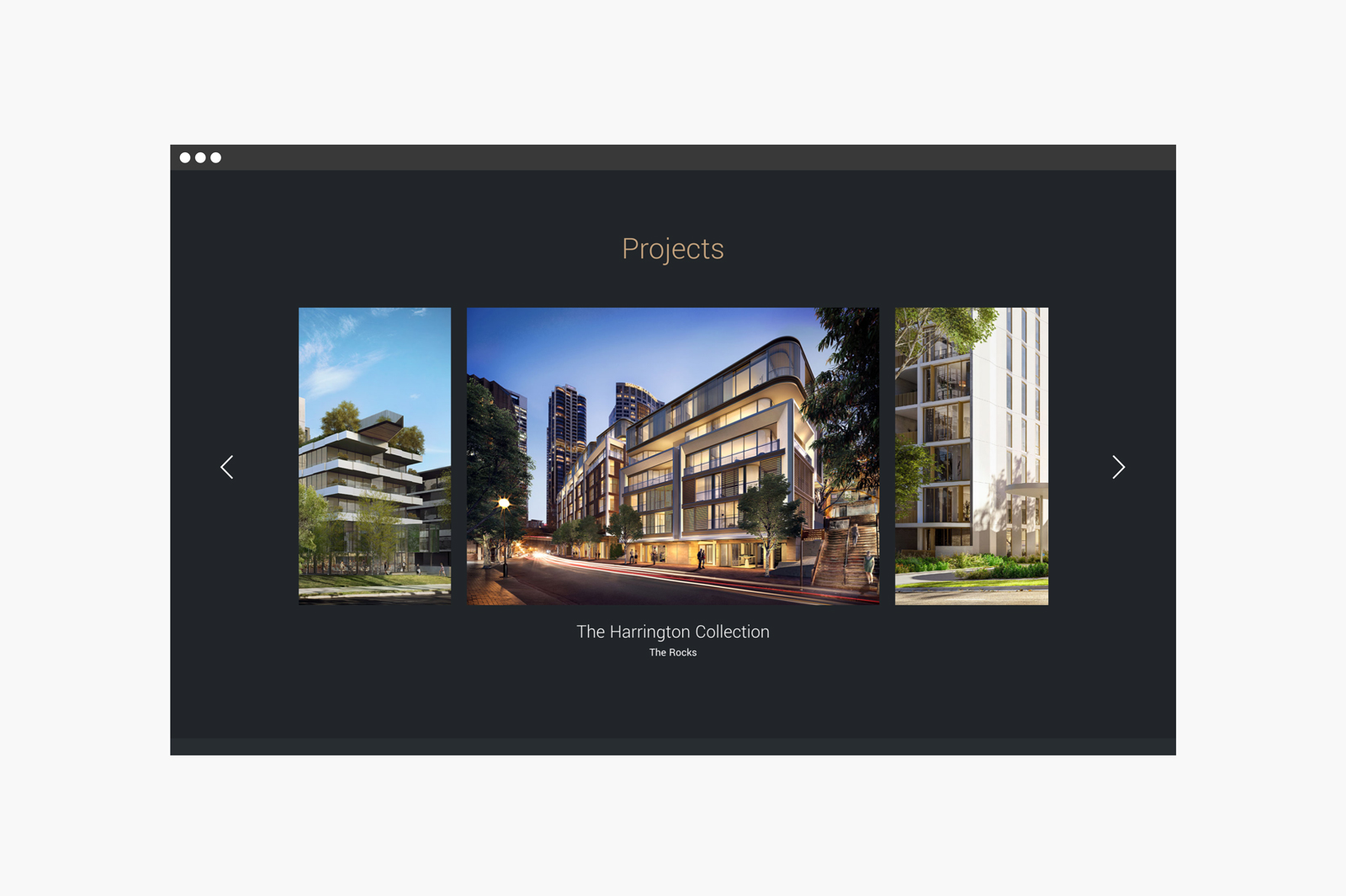
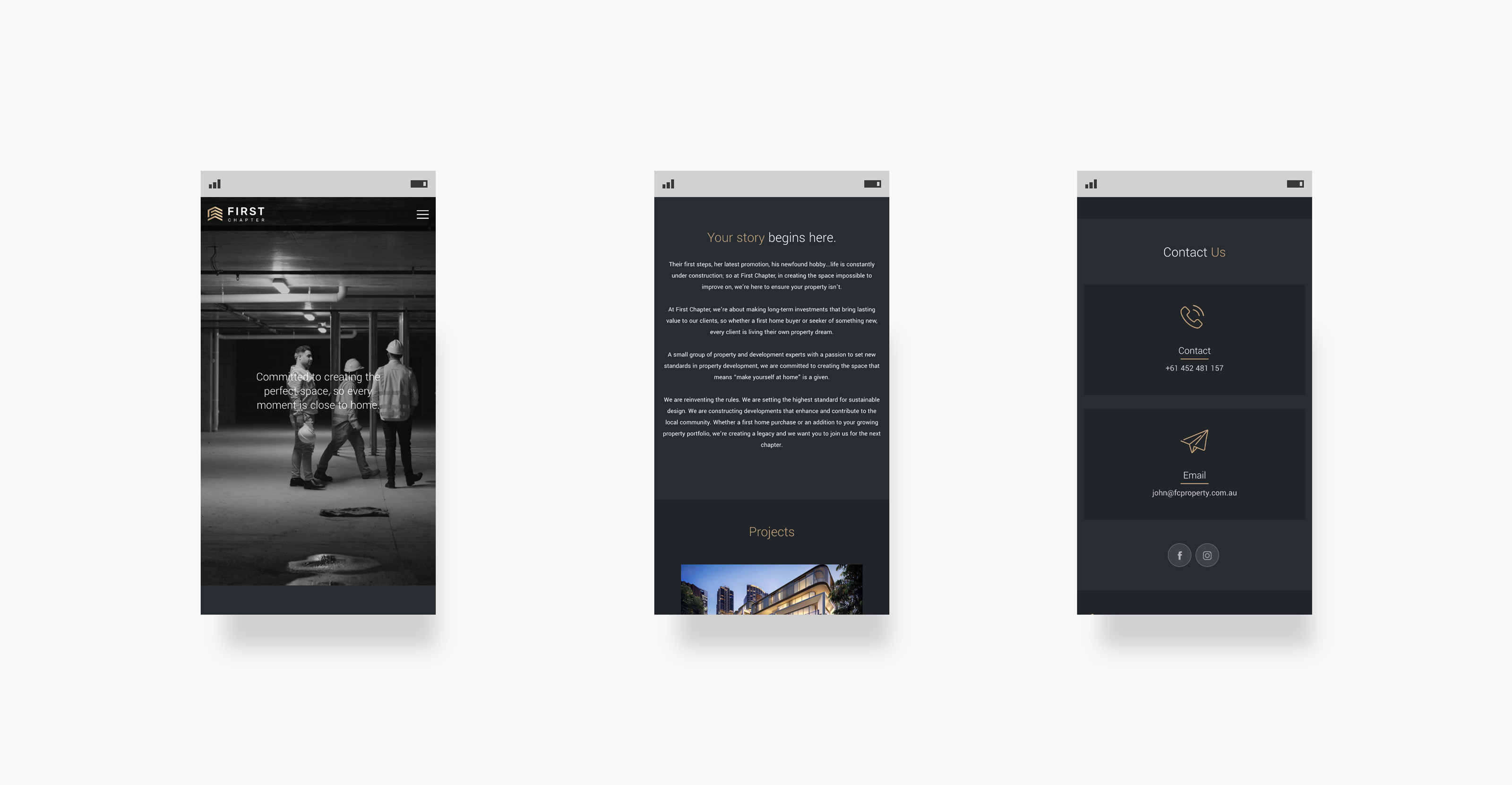
Our design of the website follows suit on the brand guidelines we created. Going with a minimalist look to support the product imagery provided.
Copywrite
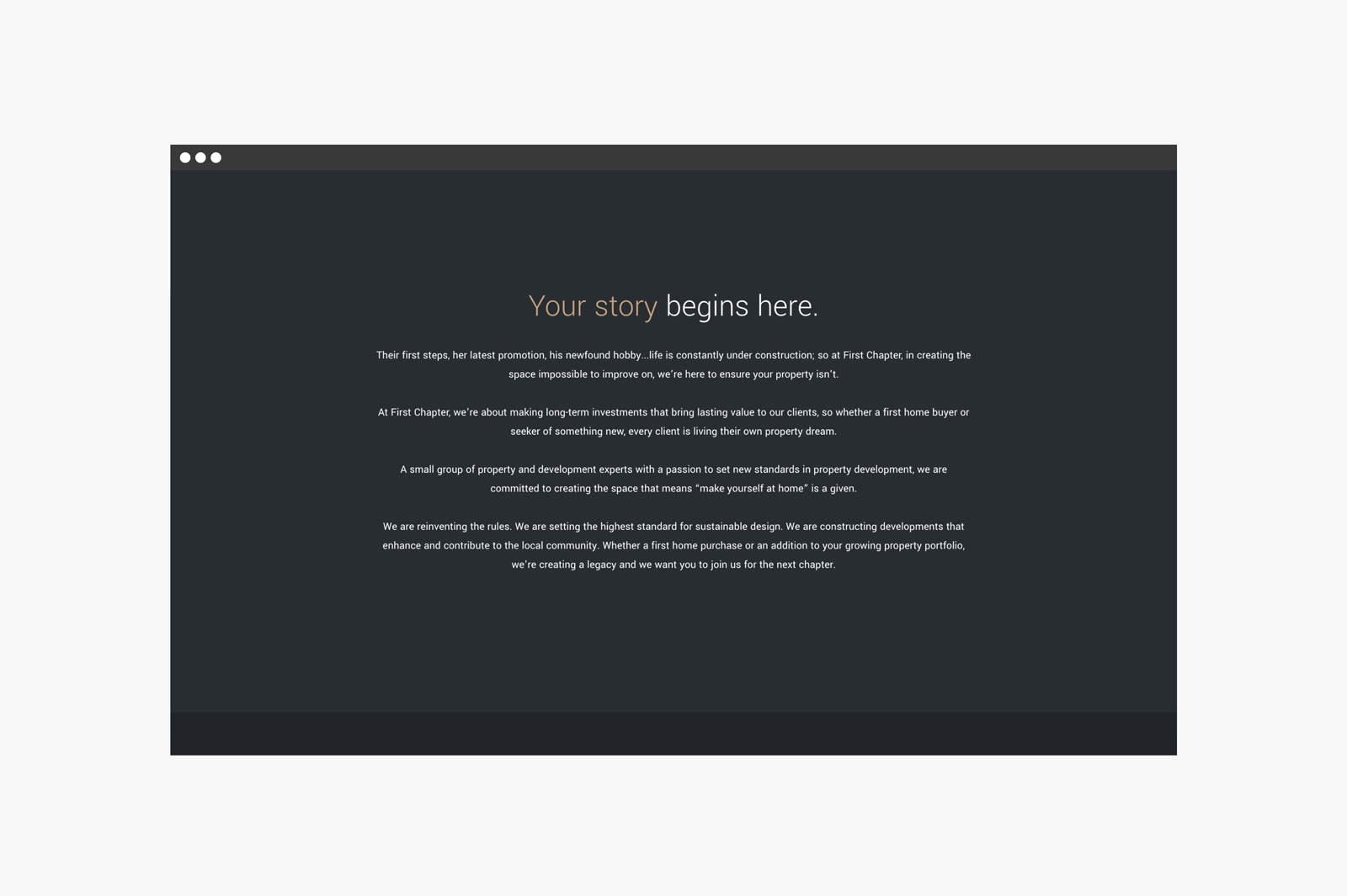
Our copy for First Chapter delves deeper into their product, exploring ideas of story writing & new beginings.
First Chapter - Your story begins here.
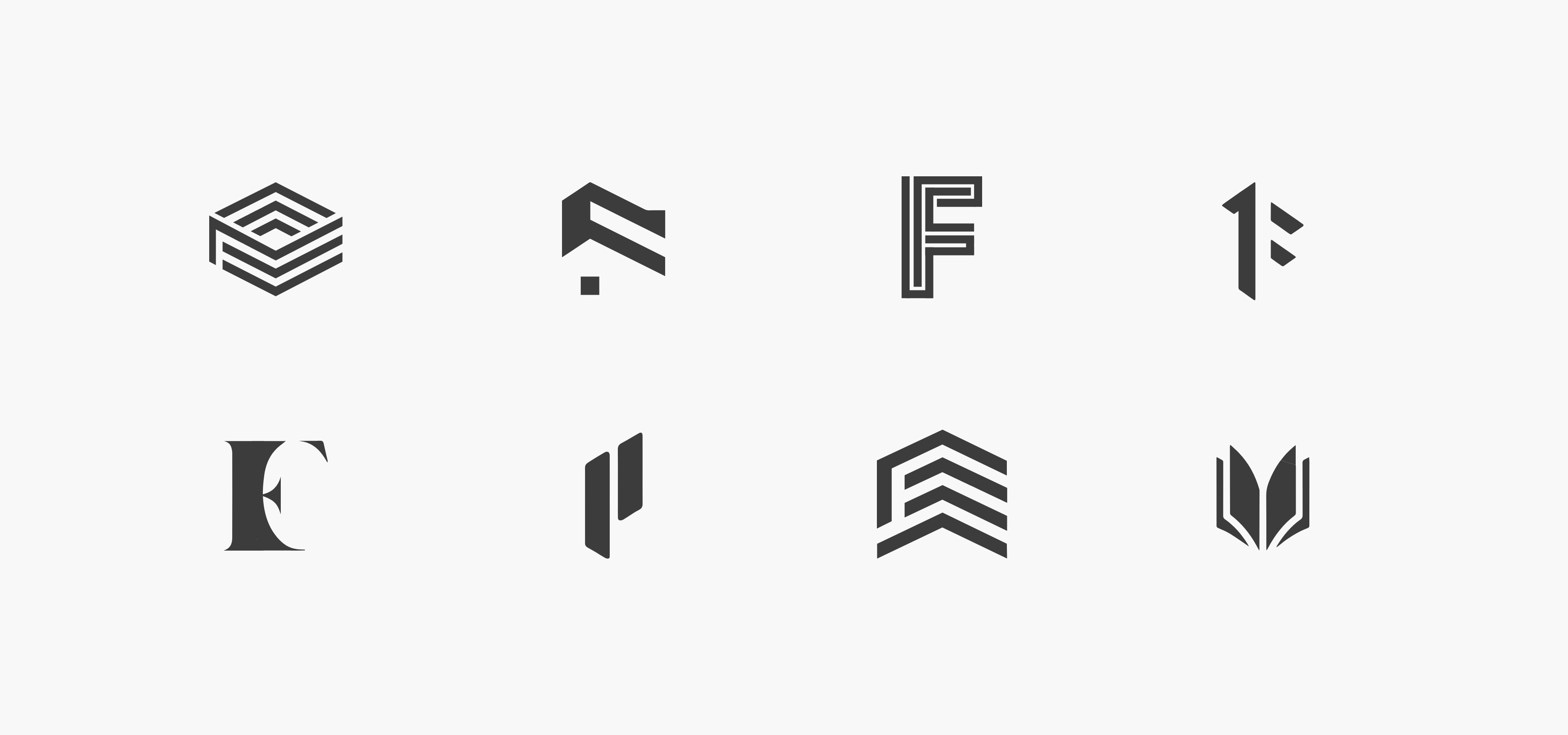
We explored ideas of books, buildings & construction for the identity of First Chapter (logo concepts above). Ultimately, we settled for all 3 - combining each element in different perspective views. Do you see an open book or the face of a building?

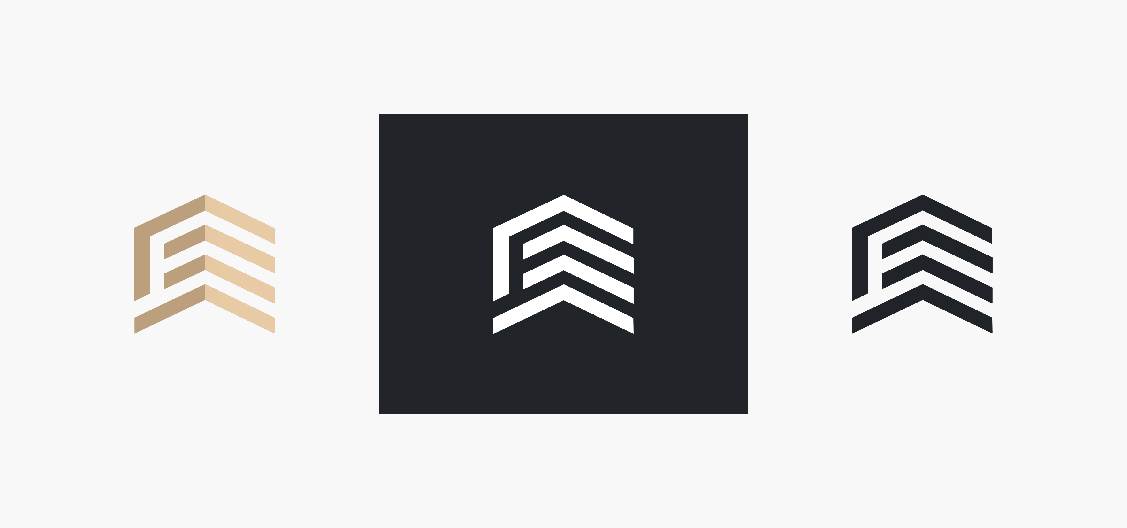
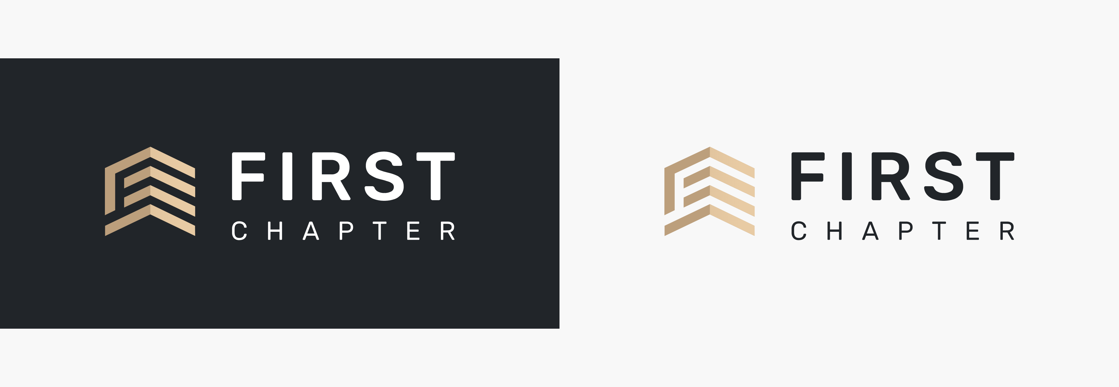
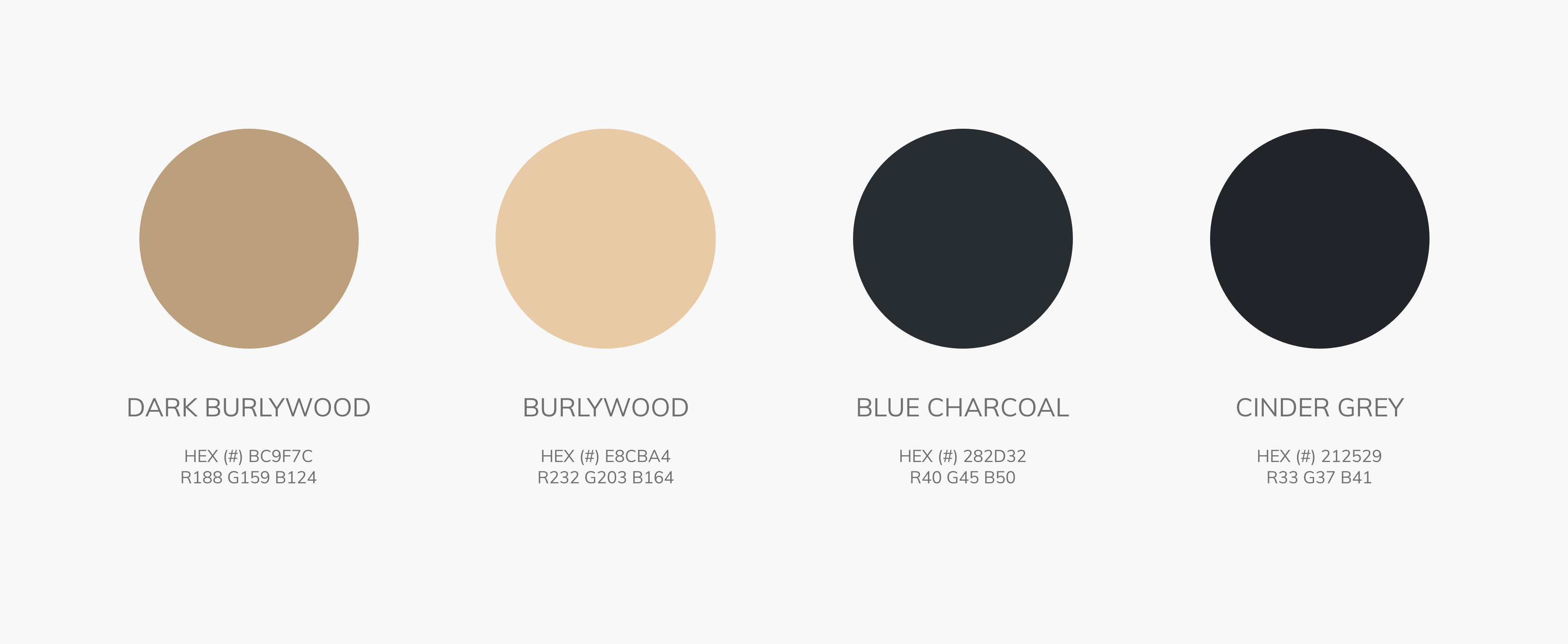
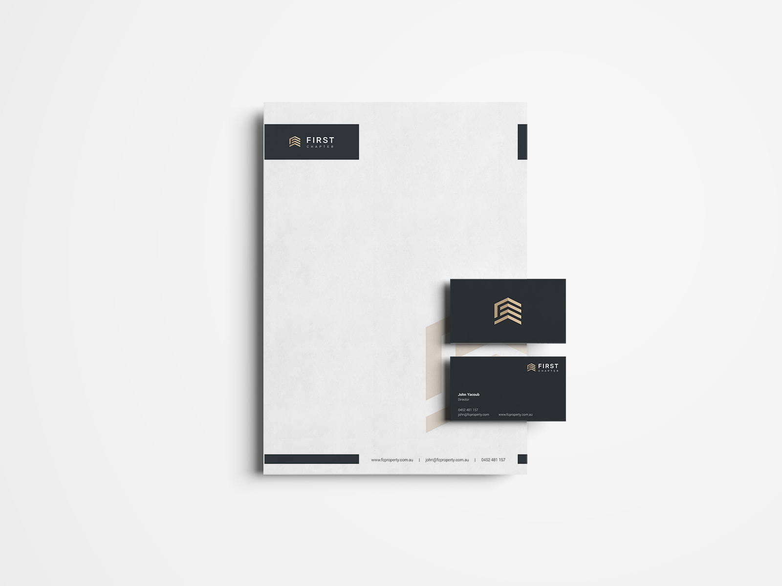
Our challenge was how to help First Chapter become an easily recognisable brand. We created a wider digital colour palette to support the minimalist design of the website.
We designed the site with the user in mind. The minimalist look of the site allows the photography to shine, showing the user the premium product that First Chapter delivers.
